Custom HUDs for Quake Live

-
Author:
eXuAls
-
Date added: 2010-11-15 00:48:29
-
Description: O____________________________o
-
Download

-
Author:
cha1n
-
Date added: 2010-11-14 21:24:52
-
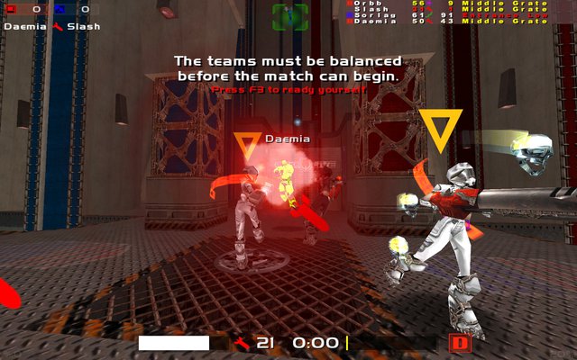
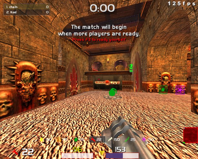
Description: My first HUD. Try it out.
-
Download

-
Author:
Raz0rblade
-
Date added: 2010-11-14 13:57:35
-
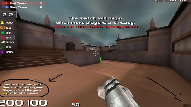
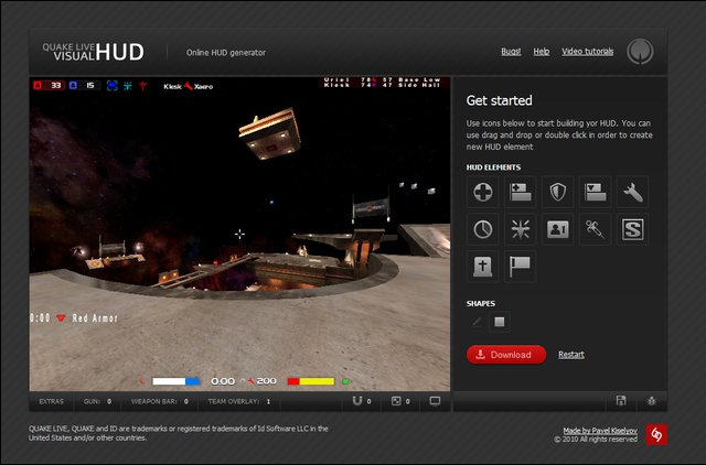
Description: My first custom HUD done with namad's HUD-generator. I've kept it simple with big elements (especial timer) and a custom extra crosshair. Should fit for all gametypes. I include the .vhud file so u can change it like u want with the HUD-generator.
-
Download

-
Author:
qop
-
Date added: 2010-11-13 22:46:05
-
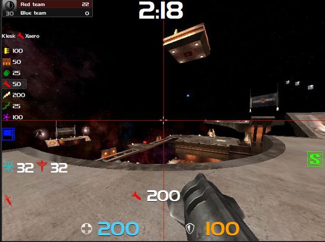
Description: this shall be the last HUD from me, wait... This time its 2 HUD's: First HUD is normal and shows everything (incl. serverskill bottom right) and the second HUD is the same, but it doesn't show CHAT-AREA and serverskill. Why this: because there are so many morons online. Just turn of the chat and have fun with quake live. No more server-messages too ofc. (the chat gets still received, u can check it whenever u want by switching to the other HUD). Also new fancy weapon/crosshairsettings that are rly good i think.
-
Download

-
Author:
eXuAls
-
Date added: 2010-11-12 18:11:36
-
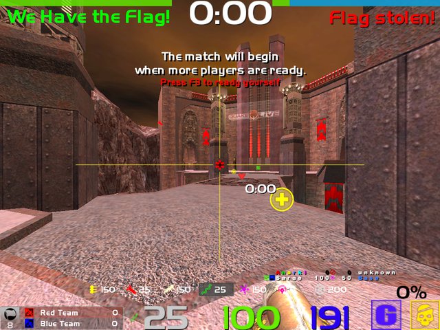
Description: This hud is a remake of the previous one. It seems a few of the players like to have the weapon bar on the side and the timer more visible. I feel the same so I moved them. For now, its all in one spot for yourself, health armour, ammo, and timer. Team based games are more all at the top. Including things like flag, deaths, and so on. Im a very visual player, so I feel that instead of having numbers there should be colour code in bars. Its more visible than some may think. It catches the eye much better than numbers that are slightly coloured. As much as huds are a customization of how a player sees the game, it doesnt change your map knowledge or your predictions. But this hud should help you because like I said Im very visual. So for me, it improves my gaming by 50%. Now there is an auto extract following this, customized to my liking, but everyone sees differently. So take five minutes to change it to your liking or try it how I have it set. It also helps for your gamma and fov, and all the different settings not to be drastically overboard. I see some players running too high to compensate for their blind sides, which I find dumb because it makes the characters models further away and harder to hit in the air. Or simply too bright and hard to continue playing after a few hours. Or quality just shitty and all the maps start to look the same. The way this is set, icons are much easier to see and they stand out the way I have them set in the config, as well as character models. Some think that the gamma and quality lowered will help to see the character, but this fixes that. So they can stand out in the dark you could lower your gamma almost all the way. Its like drawing a highlighter around the character. Also, its 2010, we dont need to run this game as if we have a 1999 computer. Like I said, map knowledge and predictions and timing are most key factors. It has nothing to do with the way it looks. But I guess thats just personal opinion, because I cant stand running the way anyone else does. Most may feel otherwise. http://www.quakelive.com/#profile/summary/eXuals
-
Download
